Slideshow Images for Each Screen Size v27.1+
A slide of a slideshow can show a different image on a small screen. For example, a wide banner shows on a computer, and a tall version of the same banner shows on a phone.
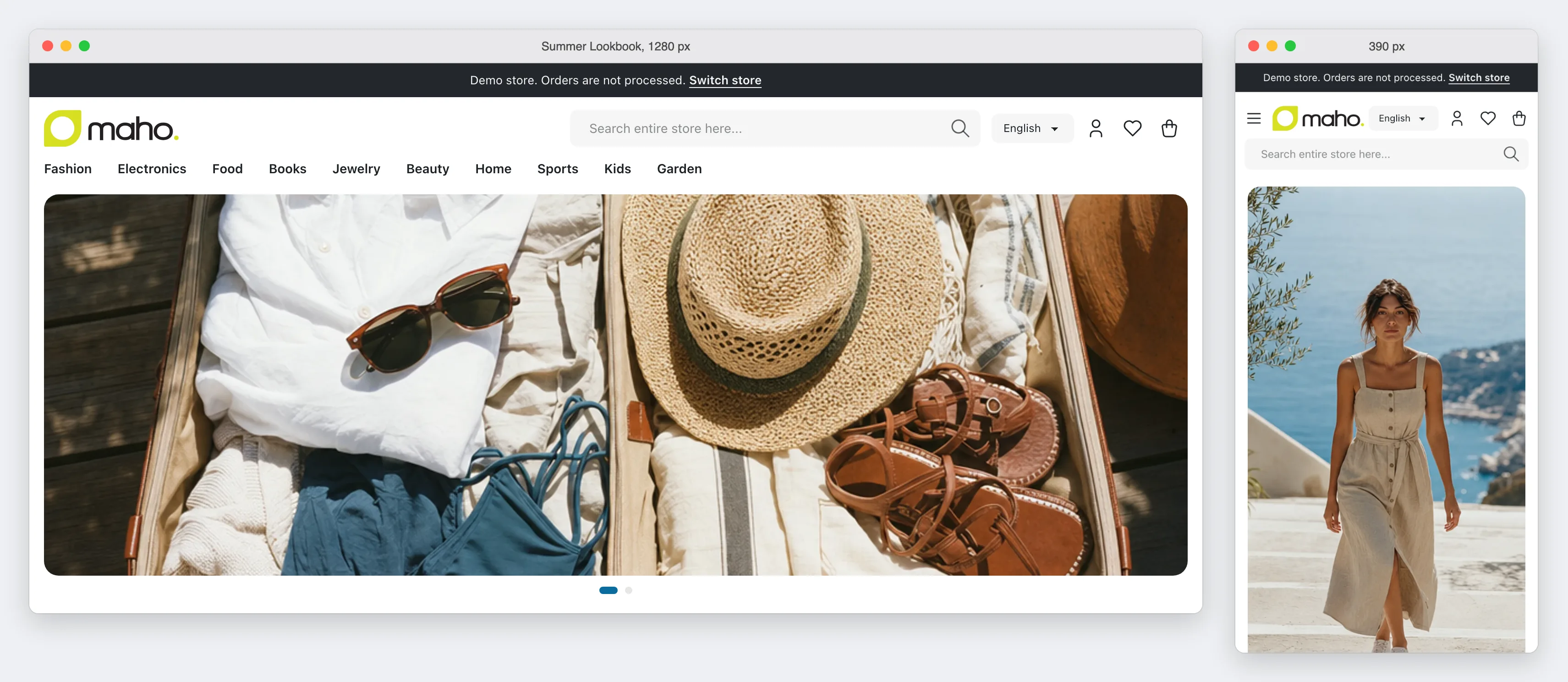
Each alternative image has a breakpoint. The breakpoint is the widest screen, in pixels, that shows the alternative image. A screen that is wider than every breakpoint shows the default image of the slide.
Add an image for a small screen
- Double-click the slideshow in the content editor.
- Find the slide, then click Add mobile image.
- Select the image in the media library.
- In Breakpoint, select a preset from the list, or type a width in pixels, such as
900. - Click Insert Slideshow, then save the page or the block.
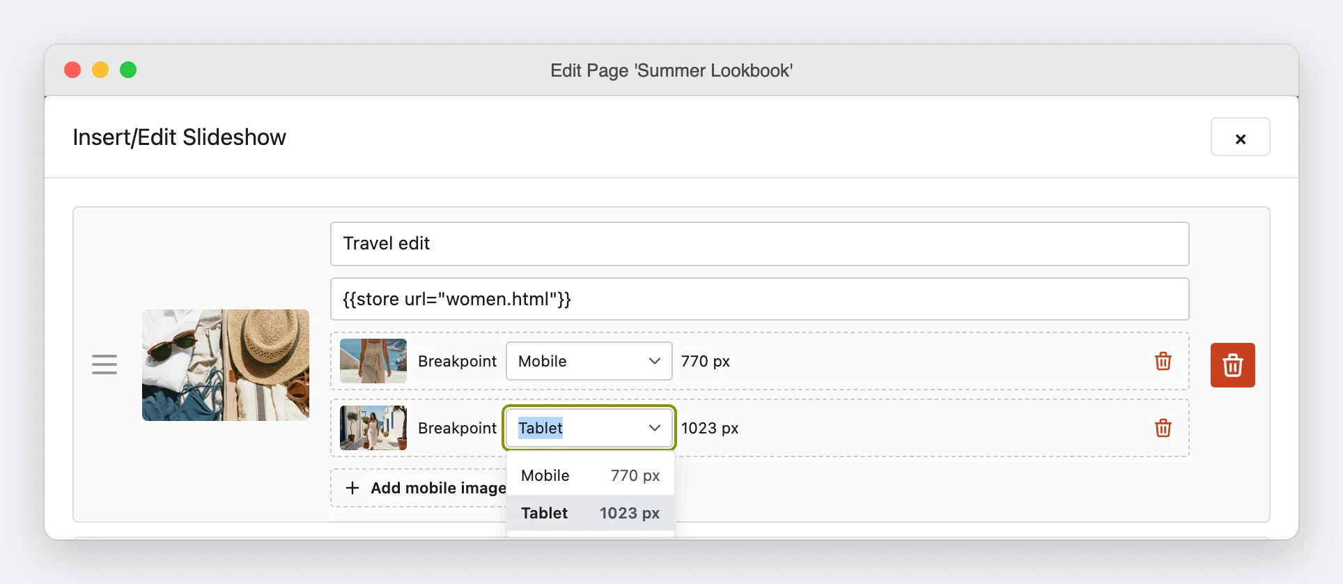
A slide can have more than one alternative image, for example one for Mobile and one for Tablet. Two images of the same slide cannot have the same width. The editor puts the narrowest breakpoint first, because the browser uses the first image that matches the screen.
Presets and custom widths
| Breakpoint | The content stores | After a change of the preset |
|---|---|---|
| A preset, such as Mobile | The name of the preset | The slide uses the new width |
A width that you type, such as 900 | The width in pixels | The slide keeps its width |
After a preset, the field shows the width of the preset, such as 770 px. Use a preset for most slides. The presets come from the theme of the store, so the images change at the same widths as the layout of the theme. Type a width for a slide that must change at a width of its own.
The widths of the presets
The theme of the store view gives the width of each preset. You cannot change them in the admin.
| Theme | Mobile | Tablet |
|---|---|---|
| Maho default and the industry themes | 770 | 1023 |
| Legacy | 770 | 979 |
A theme of your own takes the widths of its parent theme. A developer can change them in the theme.xml of the theme (see Breakpoints).
A slide with a preset and a custom width
The editor sorts the images of a slide when you save the slideshow. If the store later uses a theme with a preset on the other side of a custom width of the same slide, the order of the images is wrong. Open the slideshow and click Insert Slideshow again to sort the images.
The editor sorts the images with the presets of one store view: the store view of the page or the block, or the default store view. If a page or a block shows in more than one store view, and the store views have themes with different presets, a custom width can be on a different side of a preset in each store view. Then no order is correct for all of them. In this case, use only presets or only custom widths in the slide, or make one page or block for each store view.
In the source view
The source view shows each alternative image as a <source> in a <picture>. A preset is a {{breakpoint}} directive. The store replaces it with the width of the preset when it shows the page.
<picture>
    <source media="{{breakpoint code=mobile}}" srcset="{{media url="wysiwyg/banner-mobile.jpg"}}">
    <source media="(max-width: 1100px)" srcset="{{media url="wysiwyg/banner-tablet.jpg"}}">
    <img src="{{media url="wysiwyg/banner.jpg"}}" alt="Summer sale">
</picture>
Write the code of the preset without quotes, as in the example. If the store does not know the code, the browser never uses that image. It uses the next image that matches the screen, or the default image.
The content editor removes a <source> whose media is not a preset or one (max-width: ...px) value. When the editor opens the field, or when you leave the source view, it shows a message before it removes the <source>. HTML that you paste into the editor gets no message, so write a slideshow with alternative images in the source view.